Power BI Dashboard Overview
Introduction
The Power BI Dashboard provides an in-depth analysis of the software development activities within Clever IT Group. It includes key metrics such as commit counts, code additions, deletions, and user contributions. The dashboard is designed to help the team monitor performance and identify areas for improvement.
The Power BI Dashboard has various sections:
- Commits Performance
- Commits Performance by Teams
- Commits by DateTime
- Pull Requests
- Pull Requests By Time
- Workflows by status
- Workflows by users
According to the description in Our Metrics, the Power BI Dashboard contains the following metrics.
Metrics SPACE
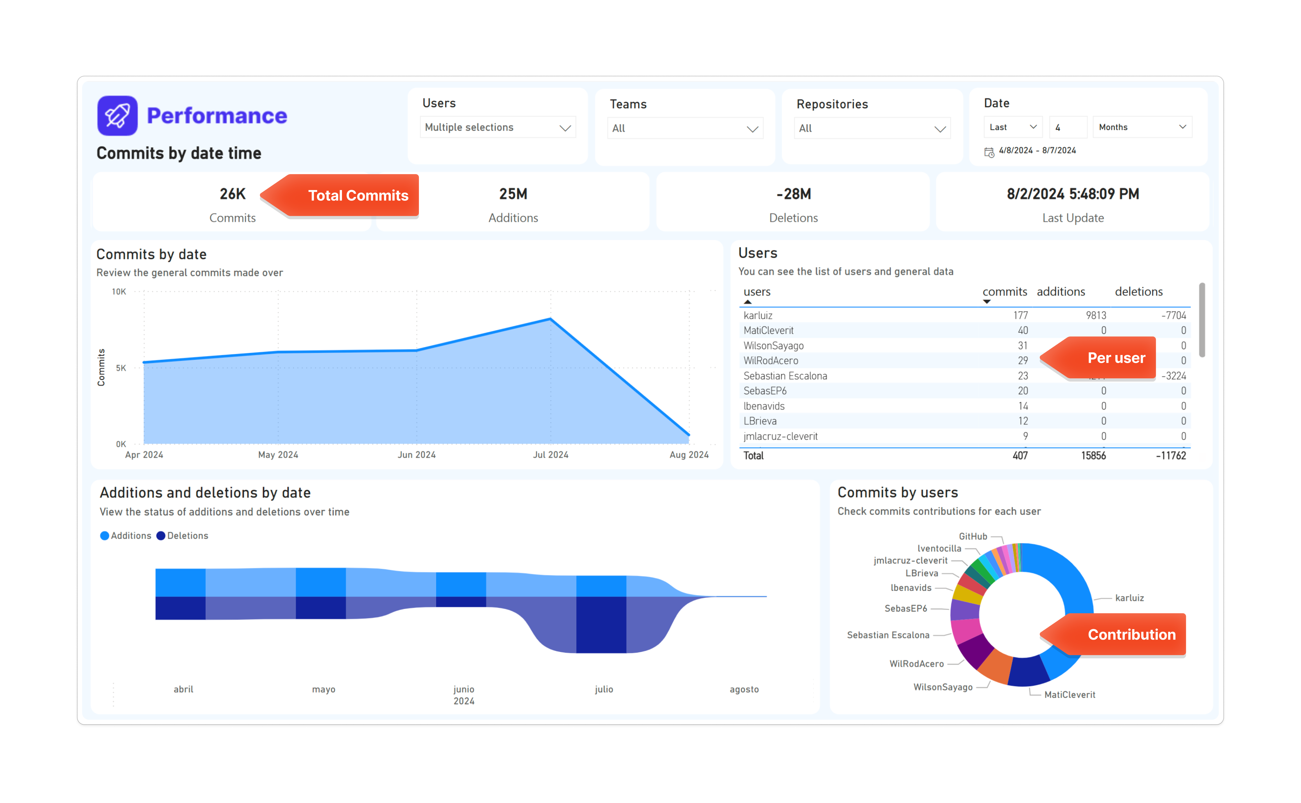
Commits performance
In this section, we show the SPACE metrics of the activity type. They are enclosed in a red circle.
Key Metrics
-
Commits:
- Total commits: 1587
- Description: Displays the total number of commits made over the selected period.
-
Additions:
- Total additions: 517,000 lines of code
- Description: Shows the total number of lines of code added.
-
Deletions:
- Total deletions: -409,000 lines of code
- Description: Displays the total number of lines of code deleted.
-
Commits by Date:
- Description: Shows a line chart of the number of commits made each day over the selected period.
-
Additions and Deletions by Date:
- Description: Displays a stacked area chart showing the number of additions and deletions over time.
-
User Contributions:
- Description: Lists each user along with their respective commits, additions, and deletions.
-
Commits by Users:
- Description: A pie chart showing the distribution of commits among different users.
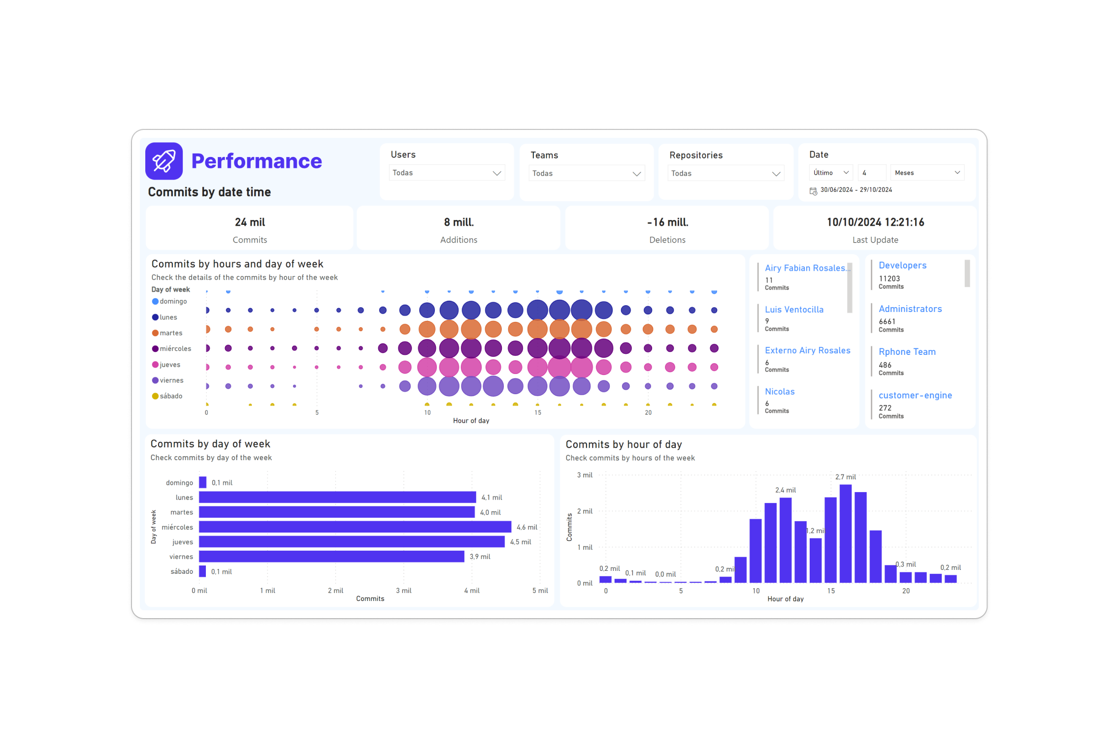
Commits by DateTime
In this section, we present the SPACE metrics of the activity type. Here, it is counted by hour, by day, and by person.
-
Commits by Hours and Day of Week:
- Description: Shows a bubble chart representing the number of commits by hours and days of the week.
- Days of the Week: Sunday, Monday, Tuesday, Wednesday, Thursday, Friday, Saturday
-
Commits by Day of Week:
- Description: Displays a bar chart showing the total commits by each day of the week.
-
Commits by Hour of Day:
- Description: Shows a bar chart of commits by each hour of the day.
Metrics DORA
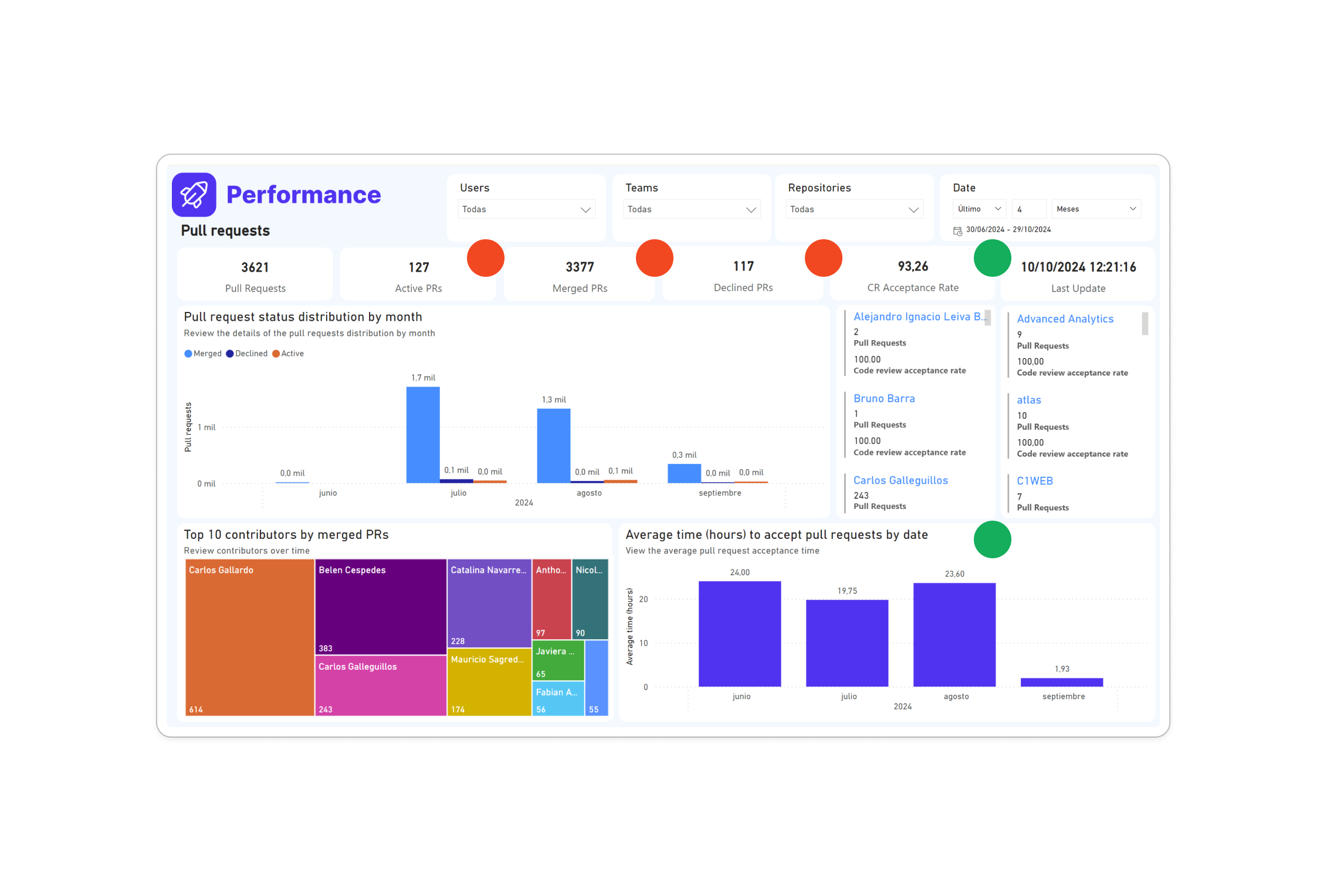
Pull Requests
In this section, we show the SPACE metrics of the type performance, communication and collaboration, and effective & flow, which are enclosed in a red circle. We can also see DORA metrics where we observe metrics such as PR Pickup Time, PR Review Time, and Merge Frequency, which are enclosed in a green circle.
-
Pull Request Status Distribution by Month:
- Description: Displays the distribution of pull request statuses by month.
- Statuses: Closed and merged, Closed without merging, Open
-
Top Contributors by Merged PRs:
- Description: Shows a treemap of top contributors by the number of merged pull requests.
-
Average Time to Accept Pull Requests:
- Description: Displays the average time taken to accept pull requests by date.
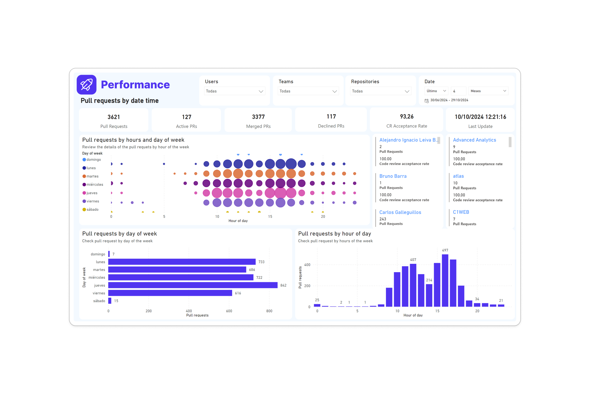
Pull Requests By Time
-
Pull Requests by Hours and Day of Week:
- Description: Shows a bubble chart representing the number of pull requests by hours and days of the week.
- Days of the Week: Monday, Tuesday, Wednesday, Thursday, Friday, Saturday
-
Pull Requests by Day of Week:
- Description: Displays a bar chart showing the total pull requests by each day of the week.
-
Pull Requests by Hour of Day:
- Description: Shows a bar chart of pull requests by each hour of the day.
Other Metrics
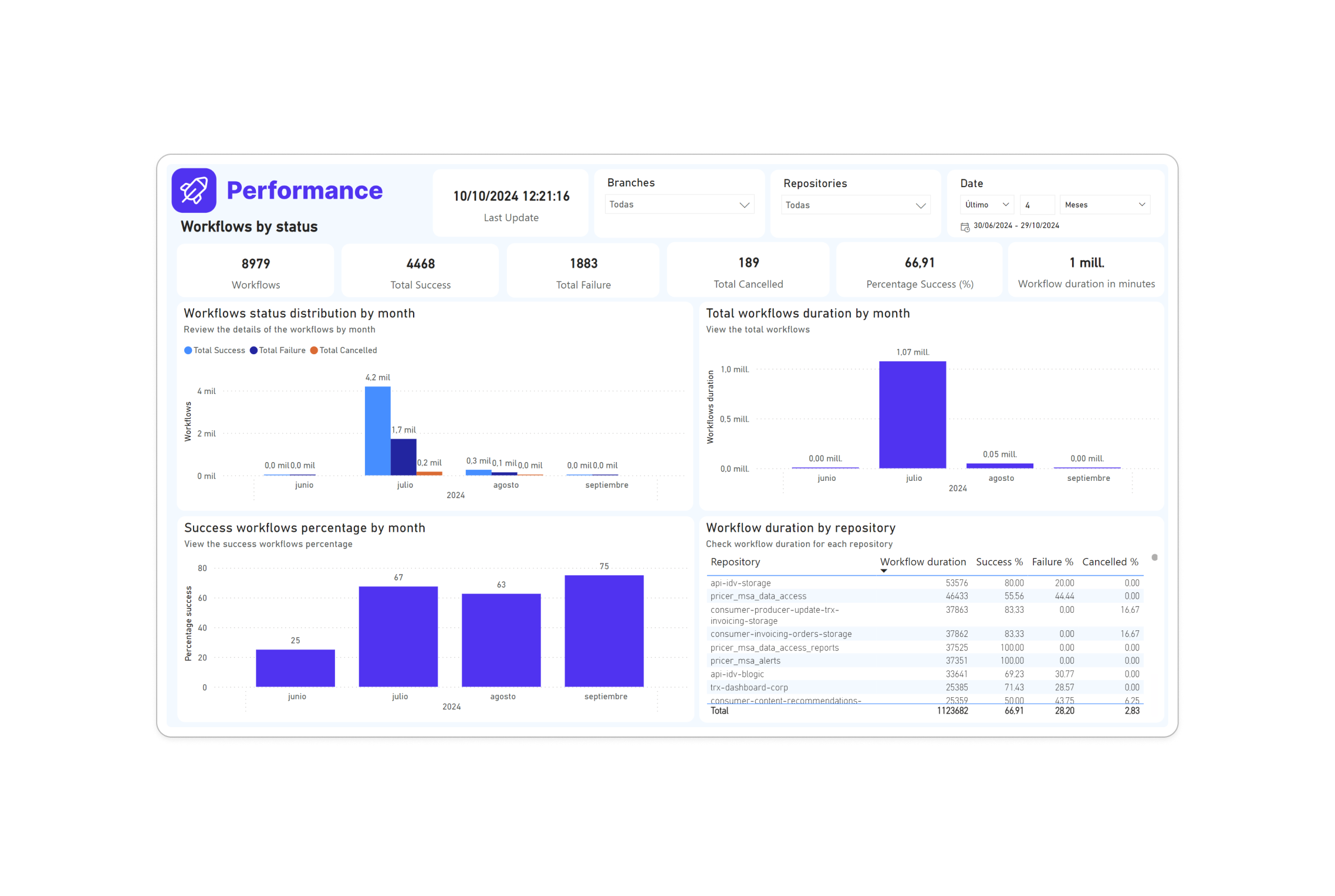
Workflows by Status
-
Workflows Status Distribution by Month:
- Description: Displays the distribution of workflow statuses by month.
- Statuses: Total Success, Total Failure, Total Cancelled
-
Success Workflows Percentage by Month:
- Description: Shows the percentage of successful workflows by month.
-
Workflow Duration by Month:
- Description: Displays the total duration of workflows by month.
-
Workflow Duration by Repository:
- Description: Shows the duration of workflows by repository.
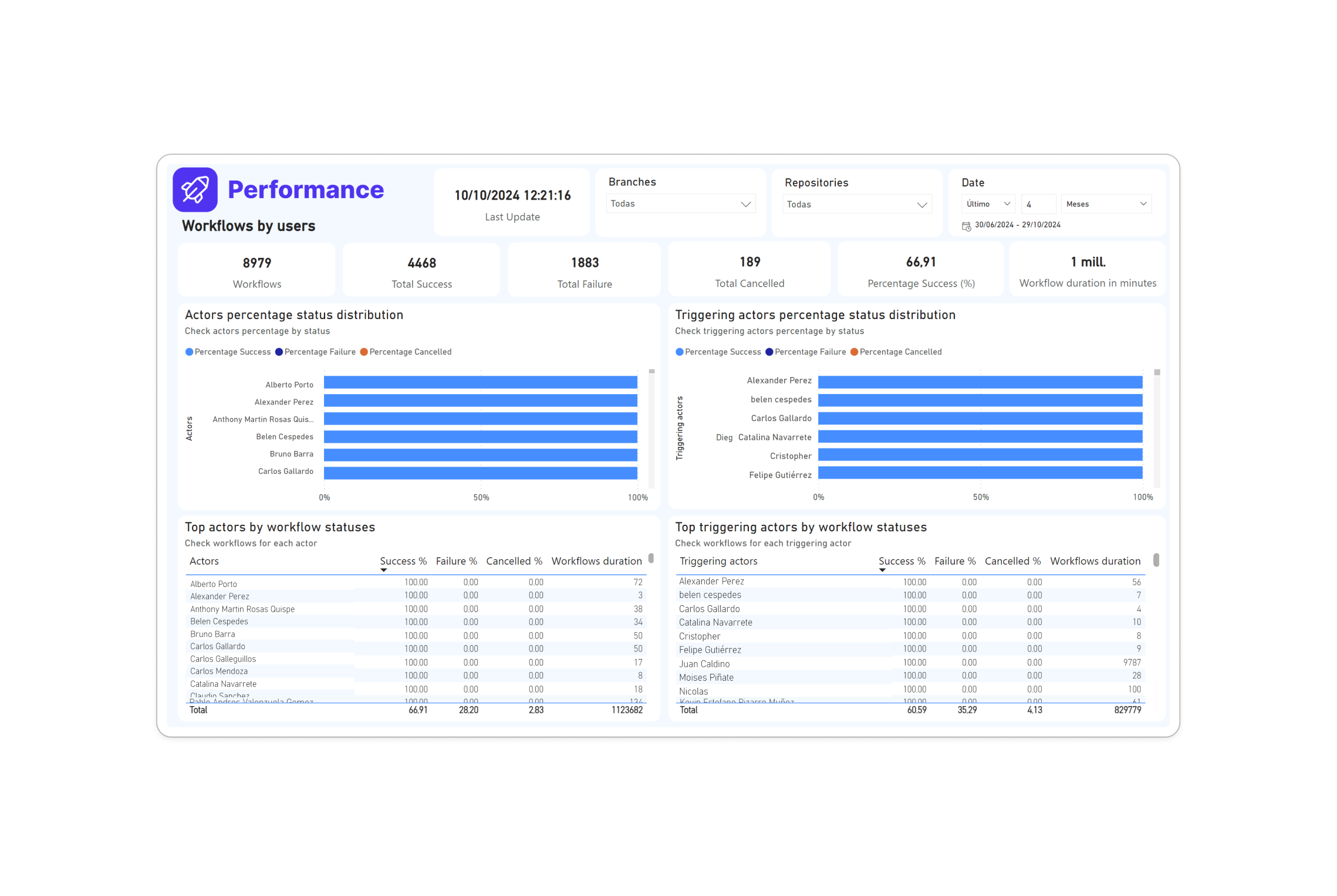
Workflows by Users
-
Top Actors by Success Workflows:
- Description: Displays the top actors based on the number of successful workflows.
-
Top Actors by Failure Workflows:
- Description: Shows the top actors based on the number of failed workflows.
-
Actors Percentage Status Distribution:
- Description: Displays the percentage status distribution of workflows for each actor.
-
Top Triggering Actors by Success Workflows:
- Description: Shows the top triggering actors for successful workflows.
-
Top Triggering Actors by Failure Workflows:
- Description: Displays the top triggering actors for failed workflows.
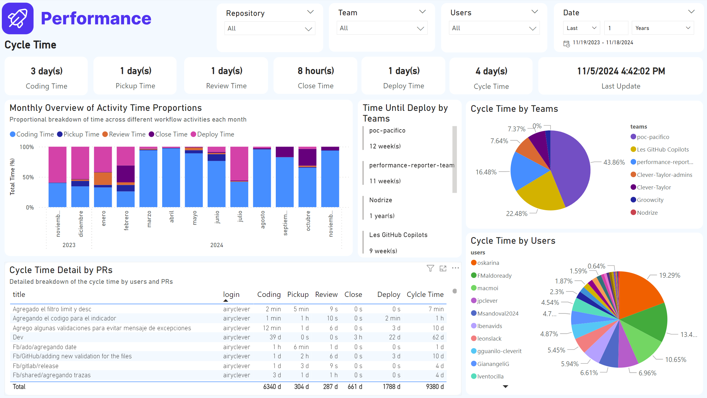
Cycle Time
-
Coding Time:
- Description: This is the time from the first commit to the creation of a Pull Request. This card shows the average time for all users. It allows you to measure the efficiency of the team in the development phase prior to the review request. A high time may indicate problems in planning or technical difficulties during development.
-
Pickup Time:
- Description: This is the time from when the Pull Request was created to when its first review was created. This card shows the average time for all users. It helps to identify how quickly reviewers start working on Pull Requests. A high time may indicate bottlenecks in task assignment or reviewer availability.
-
Review Time:
- Description: This is the time from the first review until a Pull Request was accepted. This card shows the average time for all users. It evaluates the efficiency and speed of the review process. A high time could indicate problems with code quality, team communication, or reviewer availability.
-
Close Time:
- Description: This is the time from the creation of a Pull Request until it is accepted. This field is primarily used in cases where a Pull Request is accepted without having any reviews. This card shows the average time for all users. It helps to understand the workflow on exceptional Pull Requests and can highlight areas where critical reviews are missing.
-
Deploy Time:
- Description: This is the time from when the deployment was initiated until a release is generated. This card shows the average time for all users. It monitors the efficiency of the deployment process. A high time can indicate problems in your pipeline automations or deployment infrastructure.
-
Cycle Time:
- Description: Displays aggregated time values in days, hours or minutes, segmented by the different stages of the Pull Request lifecycle (Coding Time, Pickup Time, Review Time, Close Time, Deploy Time). These values represent a summary of the accumulated times at each stage for the selected period and filters. It provides an overview of the entire cycle, helping to identify phases that could benefit from process improvements.
-
Monthly Overview of Activity Time Proportions:
- Description: It represents a proportional view of the total time spent on the different related activities per month. Each color-coded bar indicates the relative percentage of time spent on Coding, Pickup, Review, Close, and Deploy Time. This chart allows you to observe how the times for each phase improve or worsen over time. It facilitates monthly trend analysis, helping to make informed decisions about resource allocation and process optimization.
-
Time Until Deploy by Teams:
- Description: Lists teams with the average time taken from Pull Request acceptance to deployment. This is useful for analyzing team efficiency in terms of time between Pull Request acceptance and deployment execution. These numbers are typically high when there is no automated pipeline execution. Identify inefficiencies in teams' deployment processes and encourage the implementation of automation to reduce time.
-
Cycle Time by Teams:
- Description: A pie chart illustrating the proportion of total lifecycle time (Cycle Time) distributed among different teams. It allows to identify which teams have the highest participation or take the longest time in the lifecycle of Pull Requests. It helps to prioritize interventions for the less efficient teams and to recognize the most effective ones.
-
Cycle Time by Users:
- Description: A pie chart showing how the total time for Pull Requests is distributed across users. It is used to analyze the individual impact of each user on the cycle time. It highlights individual contributions, identifies users who may need additional support, and promotes equality in workload distribution.
- Cycle Time Detail by PRs:
- Description: A detailed table that breaks down the time for each Pull Request. It contains columns for the title of the Pull Request, the user who worked on it, and the time spent in each stage (Coding, Pickup, Review, Close, Deploy, and Cycle Time). At the end, a running total is shown for each column. It provides specific details about each Pull Request, allowing you to identify outliers and better understand the impact of each user on the workflow.
Implementation Details
The dashboard is built using Power BI, leveraging data sources such as GitHub for version control metrics. It provides real-time insights and visualizations to help the development team at Clever IT Group track progress and performance efficiently.
Conclusion
This Power BI Dashboard is a crucial tool for Clever IT Group, enabling them to maintain a high level of efficiency and productivity by providing a clear and detailed view of their development activities. The visual insights offered by the dashboard help the team to quickly identify trends, recognize areas needing improvement, and make informed decisions based on data.